Creating EASE’s Visual Identity: Merging Eastern Tradition with Western Aesthetics
Client
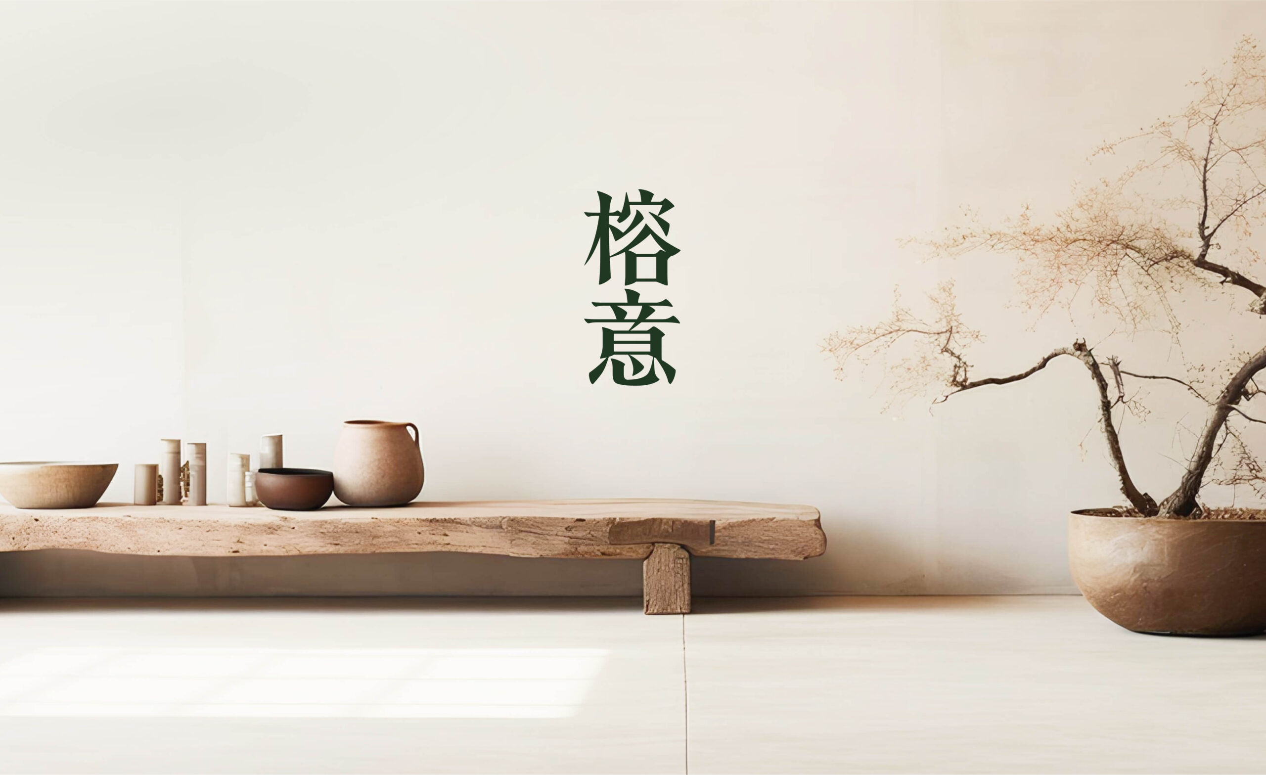
EASE
Role
Creative Director
Lead Designer
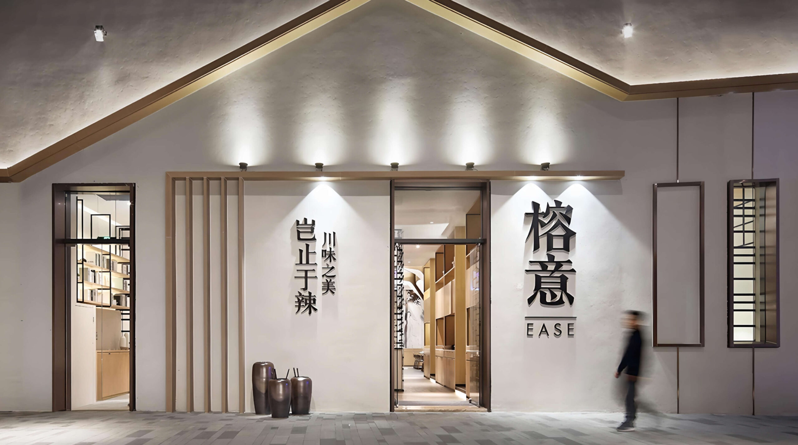
In an evolving culinary landscape, a distinctive and authentic brand identity is vital for success. Engaged by EASE, a contemporary Chinese restaurant aiming to redefine modern Chinese dining, my agency was tasked with developing a visual identity that seamlessly merged modern aesthetics with traditional Chinese culture. As Creative Director and Lead Designer, I steered this transformative project, positioning EASE as a standout in the competitive restaurant scene.
Rooted in Tradition, Designed for Today
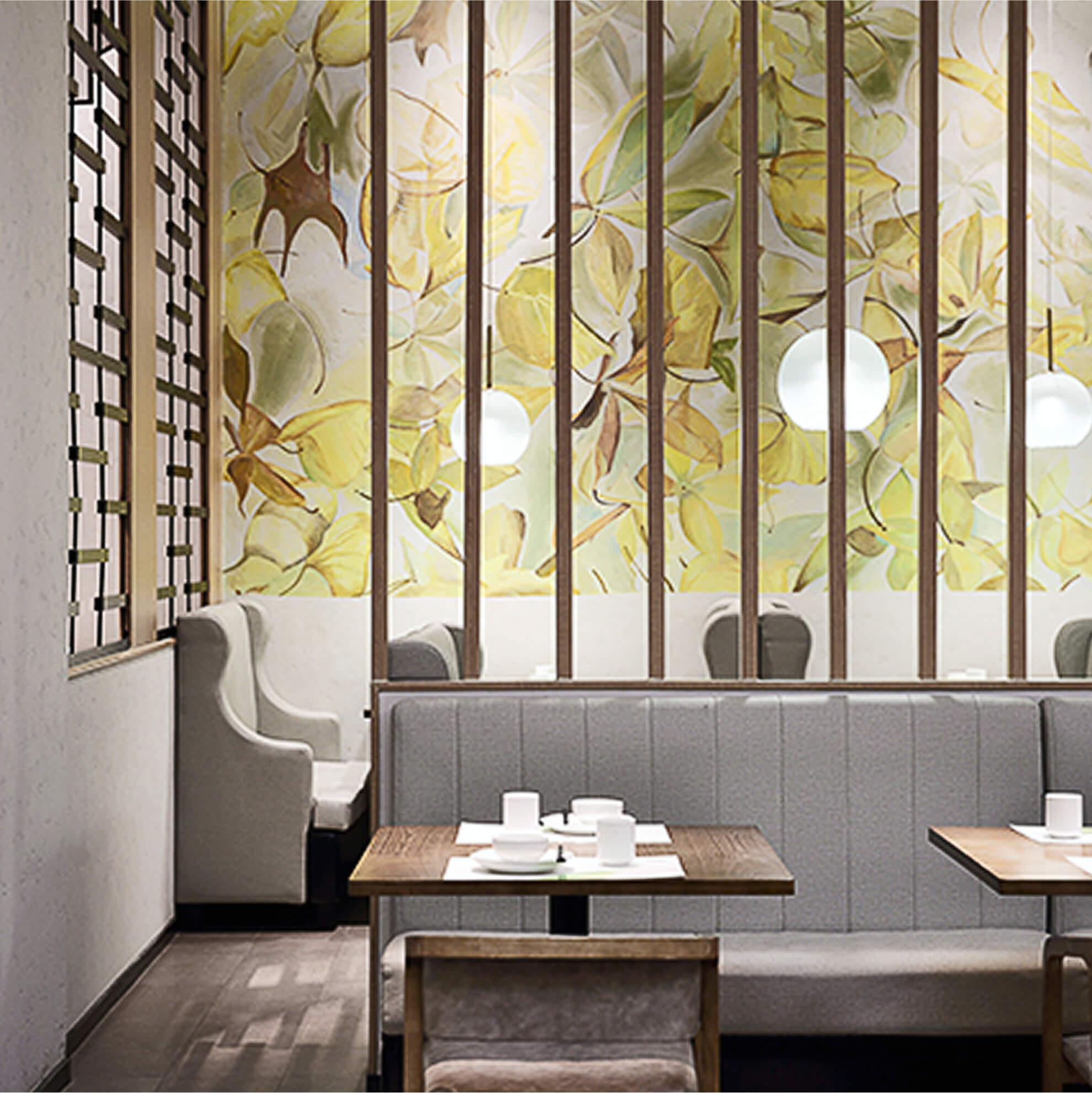
EASE’s original location beside an iconic banyan tree deeply inspired its ethos—rooted in community, history, and authenticity. The challenge was to create a visual identity that appealed to young urban diners seeking a sophisticated yet genuine cultural experience. Our design had to resonate deeply, bridging generations without sacrificing modernity or authenticity.
Strategic Fusion of East and West
Recognizing the nuanced differences between Eastern minimalism and Western complexity, I led the design strategy to create a unique blend of these aesthetic traditions:
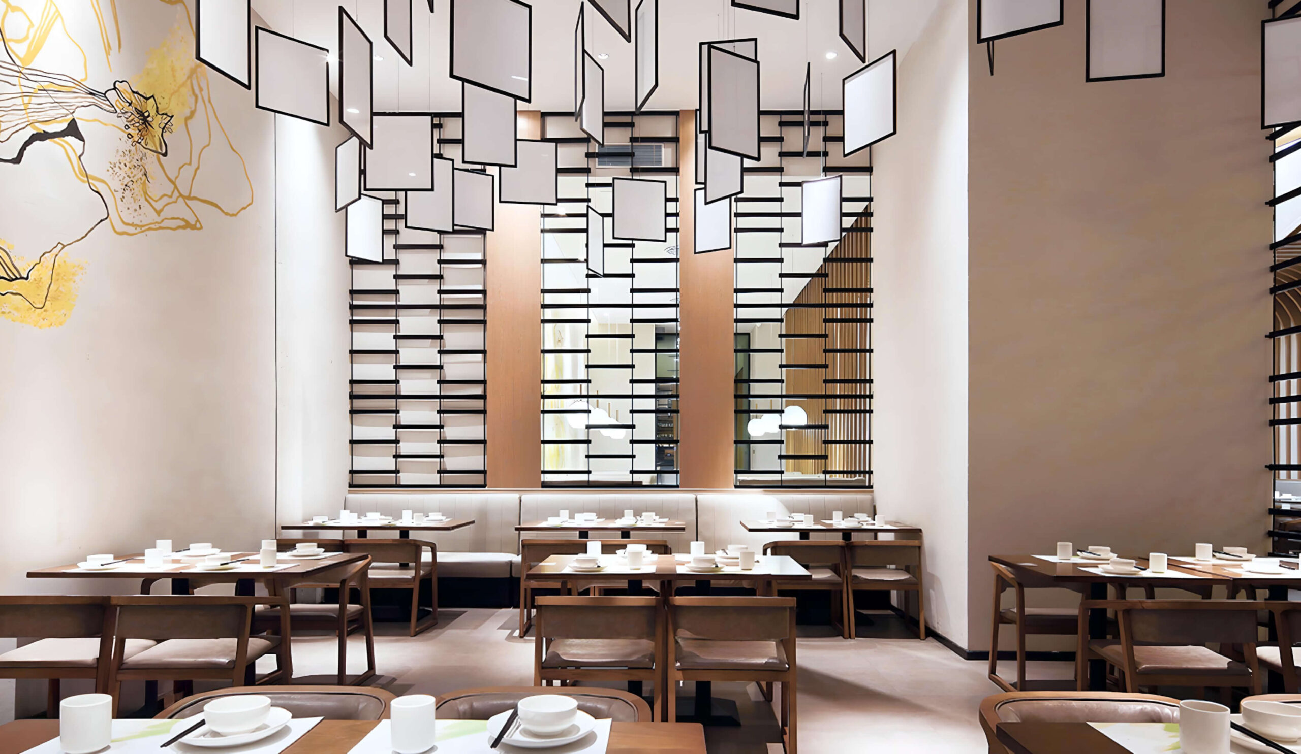
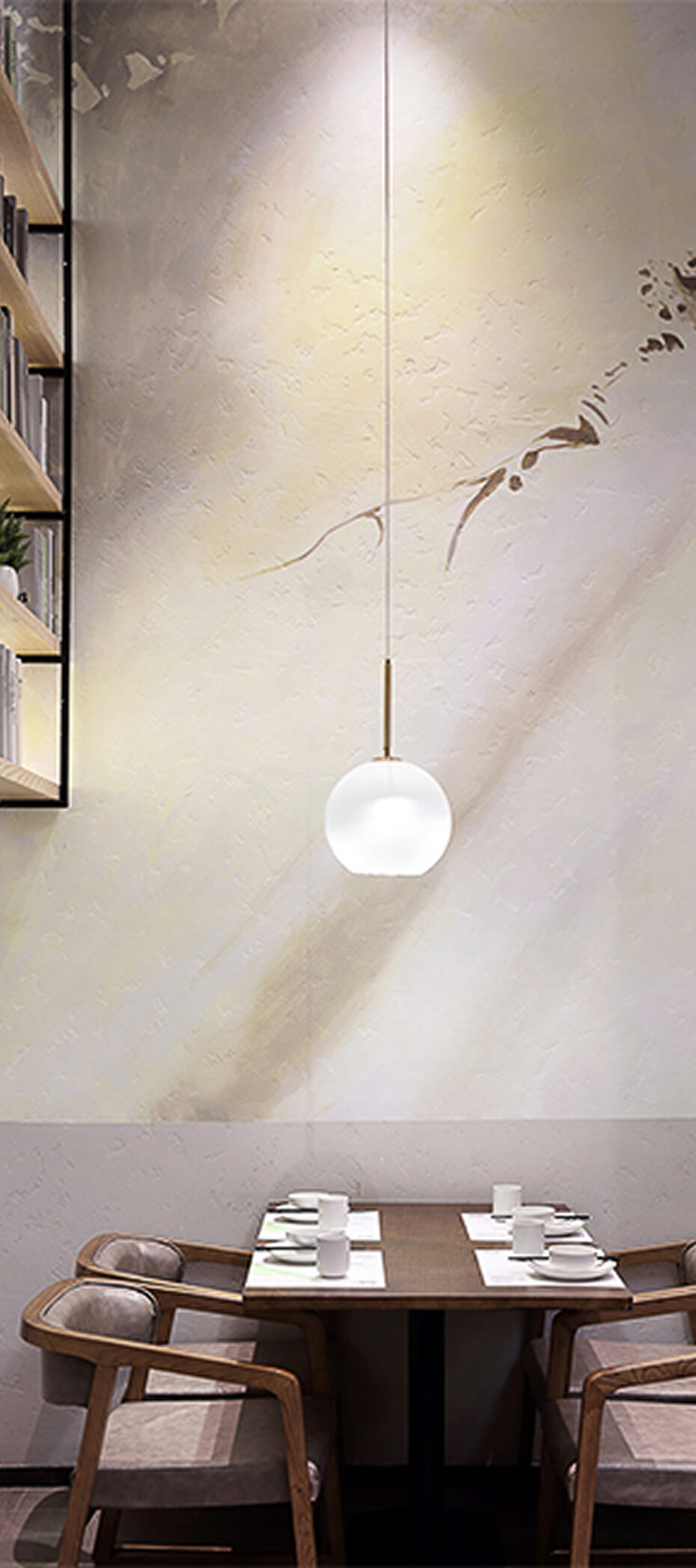
Balanced Simplicity: Leveraging Eastern principles of minimalism, balance, and embracing imperfection, our design embraced simplicity and natural elegance.
Inviting Colors & Textures: Strategic selection of colors and textures created warm, inviting dining environments, ensuring memorable experiences.
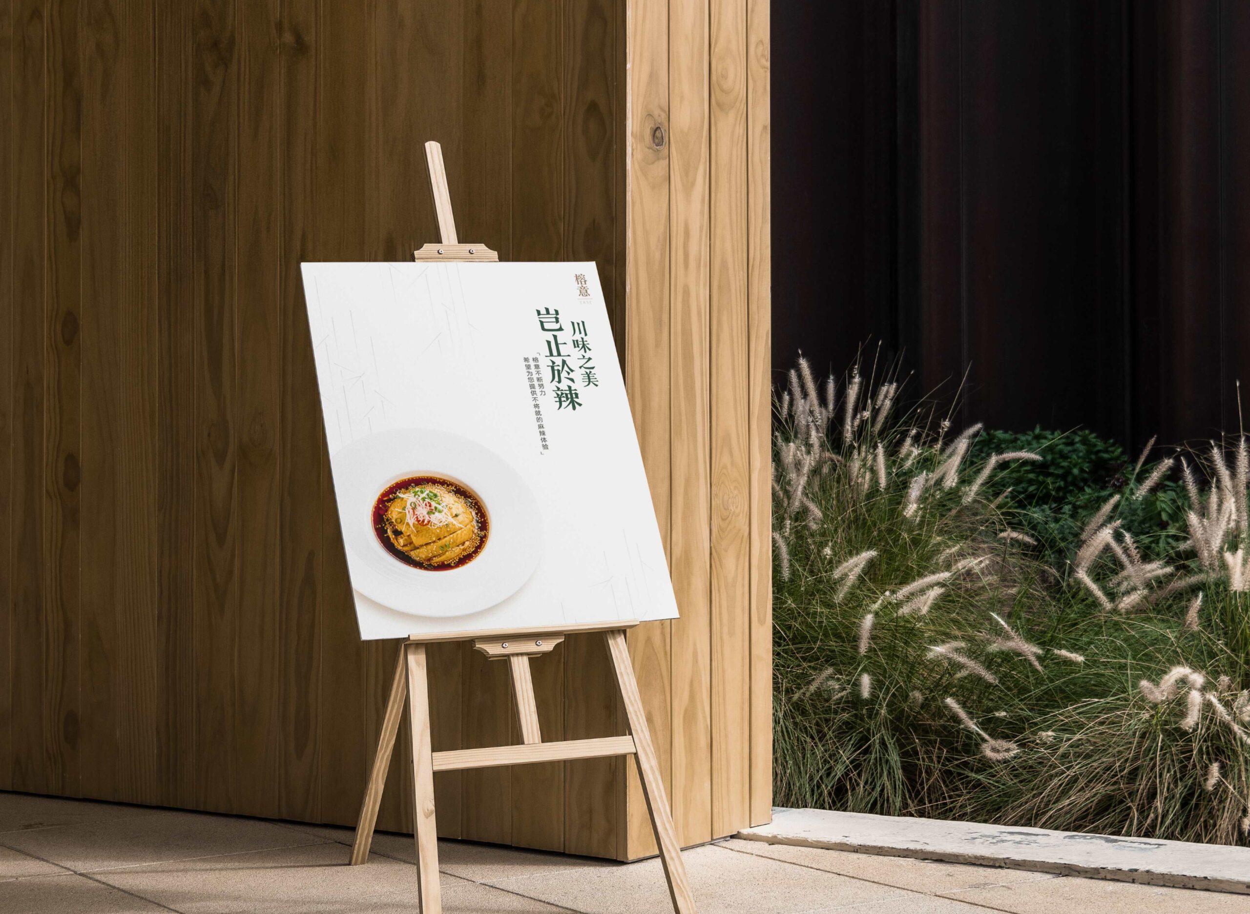
Timeless Appeal: We chose traditional typography and enduring color schemes to establish a sophisticated brand presence immune to fleeting trends.
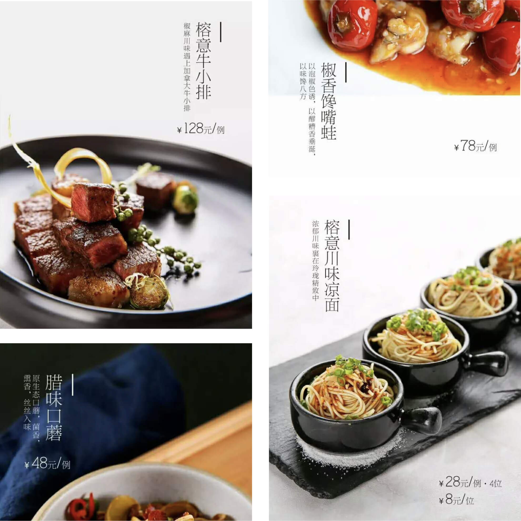
To ensure cohesive brand recognition, my team developed comprehensive brand guidelines that included shapes, patterns, textures, and color usage. These guidelines were meticulously implemented across digital media, interior design elements, and marketing materials, consistently reinforcing EASE’s visual narrative and enhancing its appeal to a discerning audience.
Remarkable Results
The strategic integration of modern aesthetics with cultural authenticity led to tangible and impressive outcomes:
Rapid Expansion: Successfully scaled from one location to five within two years, maintaining consistent brand integrity across each new venue.
Michelin Recognition: Achieved esteemed recognition by the prestigious Michelin Guide, affirming EASE’s elevated culinary and cultural positioning.
Unified Brand Experience: Consistent application of design solutions strengthened brand identity, driving customer engagement and loyalty.
EASE’s journey highlights the powerful impact that strategic, culturally-resonant design can achieve in the hospitality sector. By thoughtfully blending modern aesthetics with authentic Chinese tradition, we transformed EASE into an iconic dining destination recognized by diners and industry leaders alike.
For more details about this project or to explore similar work, feel free to reach out.
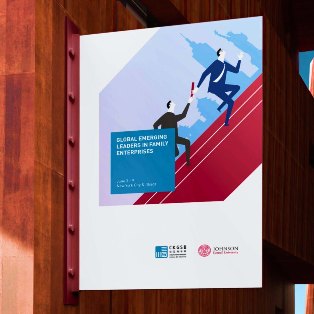
For nearly a decade, I led CKGSB’s international design efforts. From website to marketing campaigns, we tailored elite visual experiences that honored both Eastern nuance and Western expectations for a global audience.
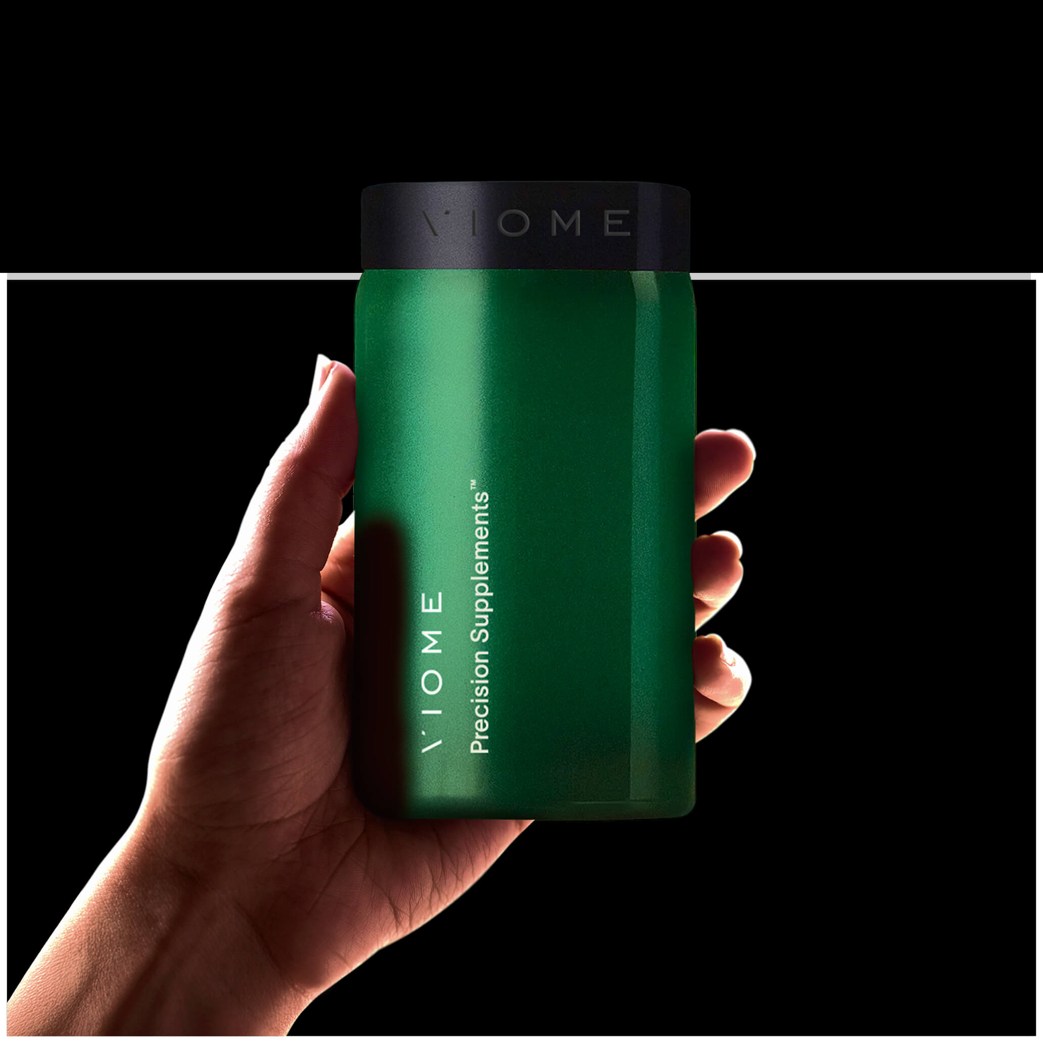
Viome
We’re actively integrating AI into our design process—analyzing research, generating ideas, editing visuals. This Viome visual blends human intuition with AI power, pointing toward the future of hybrid design.
Eli Lilly
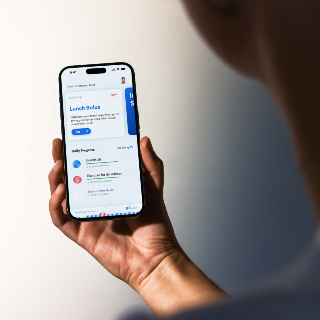
As one of the designers on Eli Lilly’s insulin pump project, I helped redesign the Type II diabetes experience. Our goal: a simple, empowering daily tool that educates users while guiding them through treatment transitions.
Neuron
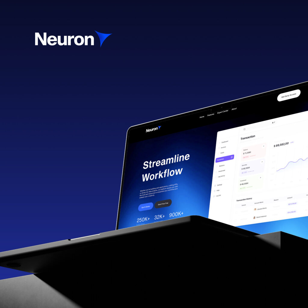
We helped launch Neuron, an AI startup for business consultants, by creating everything from the name to the product UI. Our work unified brand, web, and pitch materials to tell a cohesive story from day one.
VLS
For VLS’s clinical reports, clarity came first. We restructured content and designed accessible infographics to serve both medical professionals and new patients—ensuring critical health info is easy to scan and understand.
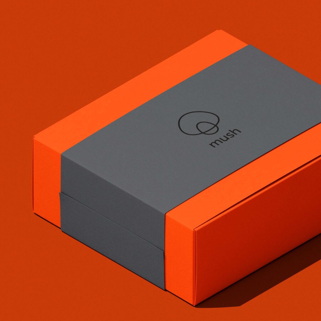
Mush
Mush, an adult-focused entertainment brand, needed identity with flair. Our logo—two simple rings forming a mushroom—evokes magic, play, and transformation, flexing seamlessly across motion, merchandise, and media.
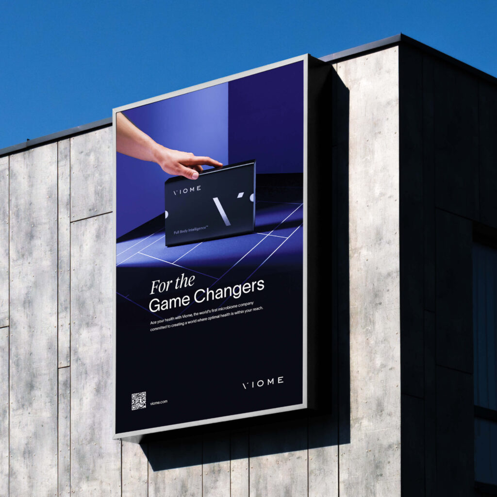
Viome
With a 24-hour deadline, we created a minimalist yet bold print ad for Viome at the US Open. By transforming a tennis court into a stage for the product, we delivered a striking visual that rose above the clutter.
Hanrad
We designed a bespoke typographic logo for Hanrad, a luxury rug brand inspired by fine art. Every letterform was sculpted to reflect timeless elegance—mirroring the craftsmanship of the masterpieces their rugs are meant to complement.